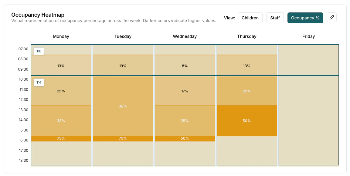
The occupancy heatmap is the central visualization tool that displays occupancy data across the week in an easy-to-read format. The heatmap shows 5-minute time intervals from 7:00 AM to 6:55 PM for Monday through Friday.
View Modes
The heatmap supports three different view modes, each providing different insights:
Children View
- Purpose: Shows the number of children present at each time slot
- Color Coding: Darker colors indicate higher numbers of children
- Hover Information: Displays detailed breakdown of children by age when hovering over time slots
Staff View
- Purpose: Shows the number of staff members scheduled at each time slot
- Color Coding: Darker colors indicate higher numbers of staff
- Hover Information: Shows staff count and scheduling details
Occupancy % View
- Purpose: Shows capacity utilization as a percentage based on target ratios
- Calculation: (Number of Children / (Number of Staff x Target Ratio)) x 100
Darker areas in the occupancy view indicate times when you may be exceeding safe child-to-staff ratios.
Reading the Heatmap
Each cell in the heatmap represents a 5-minute time slot for a given day. The colour intensity corresponds to the value being displayed in the selected view mode:
- Lighter colours indicate lower values (fewer children, fewer staff, or lower occupancy percentage)
- Darker colours indicate higher values (more children, more staff, or higher occupancy percentage)
Hover over any cell to see the exact figures for that time slot. This makes it easy to identify peak periods, staffing gaps, or times when ratios may need attention.